
How to Match Kitchen Cabinets and Flooring (Without Making Your Space Look Chaotic)
Sisters, not twins: the pairing rule that actually works
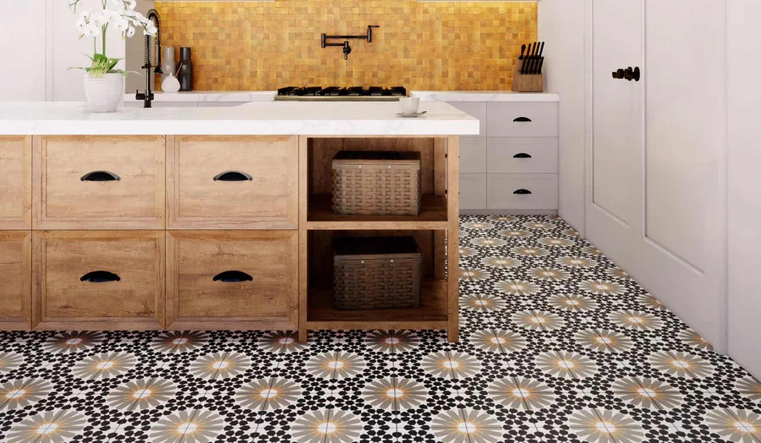
Learning how to match kitchen cabinets and flooring gets tricky when you realize the cabinets don't exist in a vacuum.
Here's what usually happens:
You chose your cabinets. They looked perfect in the showroom.
You chose your floors. Also beautiful in the showroom.
But now that they're installed side by side in your actual kitchen? Something feels off. And you can't quite figure out why.
The culprit is almost always one of three things:
❌ The undertones are fighting each other
❌ There's zero contrast between the two
❌ Competing grain patterns are creating visual chaos
The good news? All three of these issues are completely avoidable when you know what to look for before you order.
When you're figuring out how to choose kitchen cabinets, most people focus entirely on the cabinet itself: the door style, the color, the hardware. But matching the floor and cabinets is just as important. Get this pairing right, and your kitchen feels collected and cohesive. Get it wrong, and even expensive materials will look slightly off every single time you walk into the room.
Let's walk through the four things you need to know about matching floor and cabinets so your space feels intentional, not accidental.
How to Choose Kitchen Cabinets
What Undertones Are (And Why They Matter More Than Color)
Every floor and cabinet color has an undertone lurking underneath the surface color. That undertone is either warm (think yellow, red, orange) or cool (think gray, blue, green).
When warm and cool undertones are paired together, your kitchen feels slightly off, even if you can't name exactly why. When undertones match, the space feels cohesive and intentional.
This is the number one issue I see when matching floor and cabinets goes wrong.
How to Identify Undertones
Here's the trick: hold your floor sample next to a pure white card. If it looks creamy or yellowish compared to the white, it has warm undertones. If it looks gray or bluish, it has cool undertones.
Do the same test with your cabinet color sample.
If both lean warm or both lean cool, you're in good shape. If one is warm and one is cool, you've found your problem.
The "Sisters Not Twins" Concept
Your floors and kitchen cabinets don't need to be the same color. They don't need to be the same wood species. They don't even need to be remotely similar.
They just need to share the same undertone family.
Think of them as two pieces in the same family: related, harmonious, but distinctly different. Sisters, not twins.
Warm pairings:
Honey oak floors + cream cabinets with warm undertones (both warm, different colors)
Medium walnut floors + navy cabinets with warm undertones (both can share warmth depending on the specific finishes)
Cool pairings:
Cool gray LVP floors + white cabinets with gray undertones (both cool, different tones)
Concrete-look tile + painted cabinets in cool white or sage (both cool)
Common Undertone Mistakes When Matching Floor and Cabinets
❌ Cool gray floors + warm cream cabinets (they fight each other constantly)
❌ Yellow-toned wood floors + bright white cabinets with cool undertones (jarring)
❌ Red-toned cherry floors + gray cabinets (completely different undertone families)
DESIGN TIP:
If you're working on a kitchen renovation on a budget, getting undertones right from the start saves you from expensive fixes later. Once those floors are down and those cabinets are installed, switching either one is costly and time-consuming.
📖 RELATED: Once you've nailed down your undertones and figured out how to choose kitchen cabinets that work with your floors, make sure you're asking the right questions about cabinet construction. Read Kitchen Cabinet Renovation: 5 Must-Ask Questions for Your Cabinet Maker to understand framed vs. frameless construction, box materials, and what's actually included in your quote.
Matching Floor and Cabinets: Why Contrast Is Your Friend
Why Contrast Matters
When floors and kitchen cabinets are too similar in tone, the space feels flat and one-dimensional. There's no visual interest. Nothing stands out. Everything just... blends.
Contrast creates definition. It makes each element look more intentional.
The Light Floor/Dark Cabinet Combo
If your floors are light, don't be afraid to go darker with your cabinetry. This is one of the most classic and timeless kitchen combinations, and it works because the contrast makes both elements look purposeful.
Light oak LVP + dark navy cabinets? Beautiful.
White oak floors + forest green cabinets? Stunning.
Pale concrete-look tile + walnut-stained cabinets? Chef's kiss.
The Dark Floor Situation
If your floors are dark, you have two options when you're figuring out how to choose kitchen cabinets:
Option 1: Go lighter on cabinetry.
This creates contrast and keeps the space from feeling heavy. Dark walnut floors + cream cabinets are a classic pairing that never looks dated.
Option 2: Embrace the dark intentionally.
Do dark cabinetry on purpose. Moody, dramatic, and when balanced with good lighting and lighter walls, it can be absolutely stunning.
What doesn't work: Medium-toned cabinets on dark floors. It's not enough contrast to feel intentional, but not similar enough to feel cohesive. You end up in this weird middle ground that just looks indecisive.
The Same-Tone Trap
Light floors + light cabinets = flat and washed out (unless you have tons of natural light and are very intentional with other design elements).
Dark floors + dark cabinets = heavy and cave-like (unless balanced with light walls, good artificial lighting, and plenty of windows).
When matching floor and cabinets, aim for variation in tone.
Kitchen Cabinets and Grain: Pick One Hero
Why Competing Grain Patterns Create Chaos
Heavy grain on the floor + heavy grain on the cabinets = your eye doesn't know where to land. Everything feels busy. Visually loud. The space never settles.
The Rule When Choosing Kitchen Cabinets: Pick One
If your floors have dramatic grain (like plain sawn oak with big cathedral patterns or hand-scraped hardwood with texture), choose kitchen cabinets with minimal grain or a painted finish.
If your cabinets have significant grain (like natural rift oak or knotty alder), choose flooring with a more subtle pattern.
What "Heavy Grain" Looks Like
Plain sawn oak with large cathedral patterns
Hand-scraped hardwood with dramatic texture
Wide plank floors with significant knots and variation
Reclaimed wood with lots of character marks
What "Subtle Grain" Looks Like
Rift white oak (straight, fine lines)
Painted cabinetry (no grain at all)
Quarter-sawn oak (tight, consistent grain)
LVP or tile flooring (no natural grain)
Best Pairings for Matching Floor and Cabinets
✅ Dramatic wood floor + painted cabinets (perfect balance)
✅ Rift white oak cabinets + simple LVP or tile floor (both subtle, very elegant)
✅ Plain sawn oak cabinets + smooth concrete-look tile (the cabinets have grain; the floor is calm)
📖 RELATED: Getting your floor and kitchen cabinets to work together is just the beginning. For more tips on creating warmth and cohesion throughout your entire kitchen (even on a kitchen renovation on a budget), check out Warm Kitchen Design on a Budget: Layering Tips for a Lived-In Look. It walks through how to layer textures, finishes, and materials to make your space feel collected and intentional.
How to Choose Kitchen Cabinets When You've Already Ordered: Use a Rug as a Transition
When This Saves You
Maybe you've already ordered your kitchen cabinets, and the floor is installed. And now, standing in your actual space, the combination feels slightly off.
Or maybe it's not off, but you just want to soften the transition between two different wood tones.
A rug can save you.
Why It Works
A rug breaks up the visual connection between floor and cabinet. It adds warmth, texture, and an additional design layer. It draws attention away from the contrast between materials and gives your eye a place to rest.
How to Choose the Right Rug
Pick up undertones from both the floor and cabinets. The rug should feel connected to both, like a bridge between the two materials.
Choose a pattern or texture that complements both without competing with either one.
Size matters. A rug that's too small looks out of place in a kitchen. Go bigger than you think you need.
Best Rug Placements in Kitchens
In front of the sink: High-traffic area that also benefits from the cushioning.
In front of the island: Grounds the space and creates a natural zone.
Runner down the main kitchen corridor: Especially useful in galley kitchens where you're seeing a long stretch of floor and cabinet side by side.
When a Rug Isn't Enough
If the undertones are dramatically mismatched (warm cherry floors with cool gray cabinets), a rug will help but won't fix the fundamental issue.
A rug is a great tool for softening transitions and adding warmth. It's not a miracle solution for poor planning.
How to Evaluate Your Selections Before You Order Kitchen Cabinets
The Showroom Test
Always request large samples. At least 12x12 inches for tile or flooring. A full door front for kitchen cabinets, if possible.
Lay them next to each other on the floor in your actual space. Look at them in natural light at different times of day (morning light is very different from afternoon light).
Step back and squint. If they look chaotic from a distance, they'll look chaotic once installed.
The Photo Test
Take a photo of your samples together. Convert it to black and white. Do you have enough variation in tone? Is there clear contrast, or does everything blend into one flat blob?
Look at it in full color. Do the undertones feel harmonious? Or is something fighting?
The Time Test
Live with your samples for at least a week before ordering. Notice if you still love the combination after the initial excitement wears off.
Sometimes what feels fresh and bold on day one feels jarring by day seven. Pay attention to that.
Wrapping It Up: How to Choose Kitchen Cabinets That Work With Your Floors
Your floors and kitchen cabinets don't need to match. They just need to make sense together. When you understand undertones, contrast, and grain, you can make confident selections that create a kitchen that feels cohesive, intentional, and beautiful from every angle.
Plot Twist: Your cabinet layout might look great—and function terribly 😯
Those corner cabinets? Dead space waiting to happen. That drawer next to the range? Probably going to hit the handle. And don't even get me started on finishes that looked cohesive in the showroom but clash with your actual floors.
This guide breaks down the 7 mistakes I fix in client kitchens constantly:
✔️ Layout and spacing issues that aren't obvious until it's too late
✔️ Finish combos that sound good but look off
✔️ Hardware and functionality problems you can spot now instead of after install
It's free, it's fast, and it will definitely save you a headache or two.
🎉 Grab my FREE guide here→ Kitchen Renovation on a Budget: Top 7 Mistakes to Avoid When Choosing Kitchen Cabinets

Meet Taylor Ferrell: Interior Designer in San Luis Obispo
Hi there! I'm Taylor, founder of Salt Kitchen & Bath. I design kitchens and bathrooms for clients near San Luis Obispo who want spaces that are equal parts functional and beautiful. Off the clock, you'll find me testing tile samples in my own home or rearranging furniture that definitely didn't need rearranging. 🙃